Our 2026 Design Report, Why It Mattered, a 3M Naira Giveaway + Creamy Pasta for Dinner
If we had a dollar for every time someone has said “oh, Cardtonic? I know them; those guys with really great designs!” unprovoked, we would not be writing this article right now.
We would ALL be retired (well, maybe excluding our CEO and founders—they’re a bit too passionate for trivial matters like retirement) and somewhere with a great beach view, clear skies, and no Slack notifications.
In fact, we can draw a straight line from the brand love we get to the remarkable designs we make. And we’re not bluffing:
But there’s this thing about knowing you’re good at something: over time, you forget how big of a deal it is.
You accept the compliments whenever they come, and then you keep it pushing. But one day, you eventually decide to do something that counts: become a contributor to the design ecosystem.
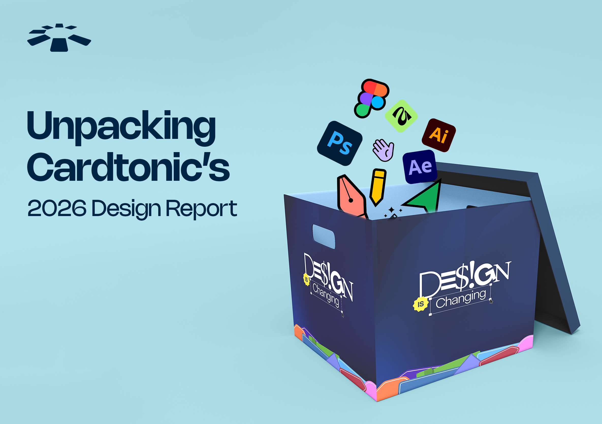
In the first quarter of one of our busiest years yet, we decided to put together our first design report.
The Story Before This Story
The origin of this design report is less dramatic than you might expect.
The unofficial gist is that after a townhall meeting, as part of our thought leadership goals, our Marketing Lead Tomi and Design Lead West sat with a specific theme for a while: design.
“How are people approaching design and branding in 2026? What’s being done brilliantly and what’s being overflogged? Most importantly, is anyone even talking about this seriously?”
The answer to that last question turned out to be: not really, no. And that’s where it clicked.
We like to do things differently, even if it means more work on our plate because there’s no prototype to copy. So, we rolled up our sleeves to do some digging.
And just like that, the brief for one of the most interesting things we’ve done this year was written.
In The Beginning Was a Boring (Brand) Design
Once upon a time, we realised that trust alone was no longer enough to differentiate a fintech brand — at least not if the goal was to stand out.
When we clocked this, we tore apart our entire design playbook and then reassembled it.
Like many in the industry, we initially leaned heavily on the colour blue in our brand identity because of its association with trust and security.
Over time, however, we saw that many fintech brands looked and felt the same. So instead of starting from scratch, the team evolved the identity. We kept the blue, but introduced a broader colour palette, louder typography, and richer photography.
The result was a brand that still felt trustworthy but also more vibrant; more culturally relevant. That was when we noticed people beginning to see Cardtonic as more than just another fintech brand.
Translation? People stopped lumping us in with everyone else. #GoalBall.
Then came Moonshot ‘25
In 2025, we sponsored Moonshot by TechCabal as platinum sponsors. It was a deliberate step up from the gold sponsorship the year before, and we came correct.
Our booth at that event—to use the specific word that kept coming back to us afterward—caused some serious commotion. But the good kind.
People would walk past, stop, walk back to stare and say hello, and then bring their friends over. In a room full of some of the most design-literate people in the ecosystem, our design was the thing people were talking about; we watched it happen in real time.
And once you see something like that, you can’t unsee it.
So We’re Making a Report: Now What?
When we decided to do this report, we all got right to work.
What followed was weeks of picking case study after case study to figure out recurring patterns and what they meant: what was working, what was changing, and the whys.
When we asked our design team to tell us about one detail within this report that they hoped readers won’t miss, they gave us two—because designers must absolutely do what’s on their own mind.
The first is found in Trend 8 of the Design Report: The Acceleration of the Rise of the Multi-Skilled, illustrated with a sequence of animals representing different stages of evolution, but tied to the creative industry.
The second is on the contributors page: it shows a laptop, with every contributor represented by a uniquely coloured sticker carrying their name, role, and a distinct scribble. In their words: “Regardless of our role—writing, researching, designing, editing—the laptop was the one tool that connected everyone’s contribution.”
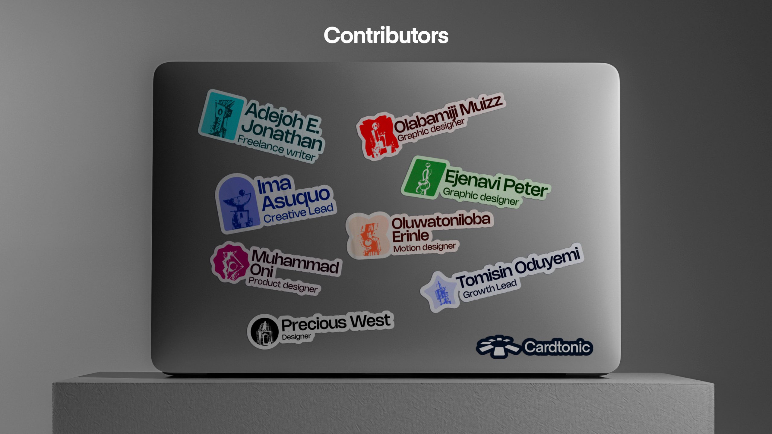
It’s like a group high-five, and as a team that works remotely (and never gets high-fives from each other), we’re slightly obsessed with that page.
Long Weeks & An Odd Hour Meeting
While working on this report, we learned a true measure of how much a team cares about something, and it’s how long AND late they’re willing to work on it.
(Did I mention that we finished with the first version of this report, had an internal review meeting, decided it wasn’t great enough, and reworked the entire thing? Yep. It was a brutal week.)
For the marketing team that handled the ideation, structuring, writing, and editing, very long hours—and more than a few very late nights—were involved.
The work demanded while writing a design report is no child’s play.
Nobody wanted a design report that read like a chore; the goal was the same one the report itself was making the case for: make it feel relatable, fun, and clever as hell. Make it everything but boring.
Writing this report took the time it took, but all of it was worth it. “You cannot hurry good writing”, Creative Associate Ima said.
And we agree. Quote us anywhere; you have our permission (just give us credit).
“But Why a Design Report?”
We’ve been asked, and we like this question.
Designers—the people whose entire job is to make the world more memorable, more emotionally legible—are often among the least celebrated people in the rooms they make possible.
A brand goes viral for its visual identity, and the designer who built that identity is nowhere near the credit line. A product wins an award and the design team, at most, gets a generic “well done” Slack message. (Not here though—we all get a “well done” AND six-figure bonuses. We’re not on the Best Place To Work list for nothing.)
It’s an odd dynamic that most people in the creative industry know and have made peace with, mostly because the alternative is spending all your time being annoyed about it.
We did not make peace with it.
We found we couldn’t, once we started being honest about how much of Cardtonic’s own story—our memorability, our recognition, our Moonshot booth, the app upgrade our users noticed—was built on the work of designers.
That’s the reason we built this for designers specifically: because we decided we owed them some recognition.
The Mixer: Designers Run a Tight Ship, Until Pasta (and Jollof Rice too) is Involved
We need to talk about this dinner.
On Sunday, the 31st of May, we hosted a bunch of brilliant brand and visual designers to an invite-only, full-course dinner event that doubled as a design mixer.
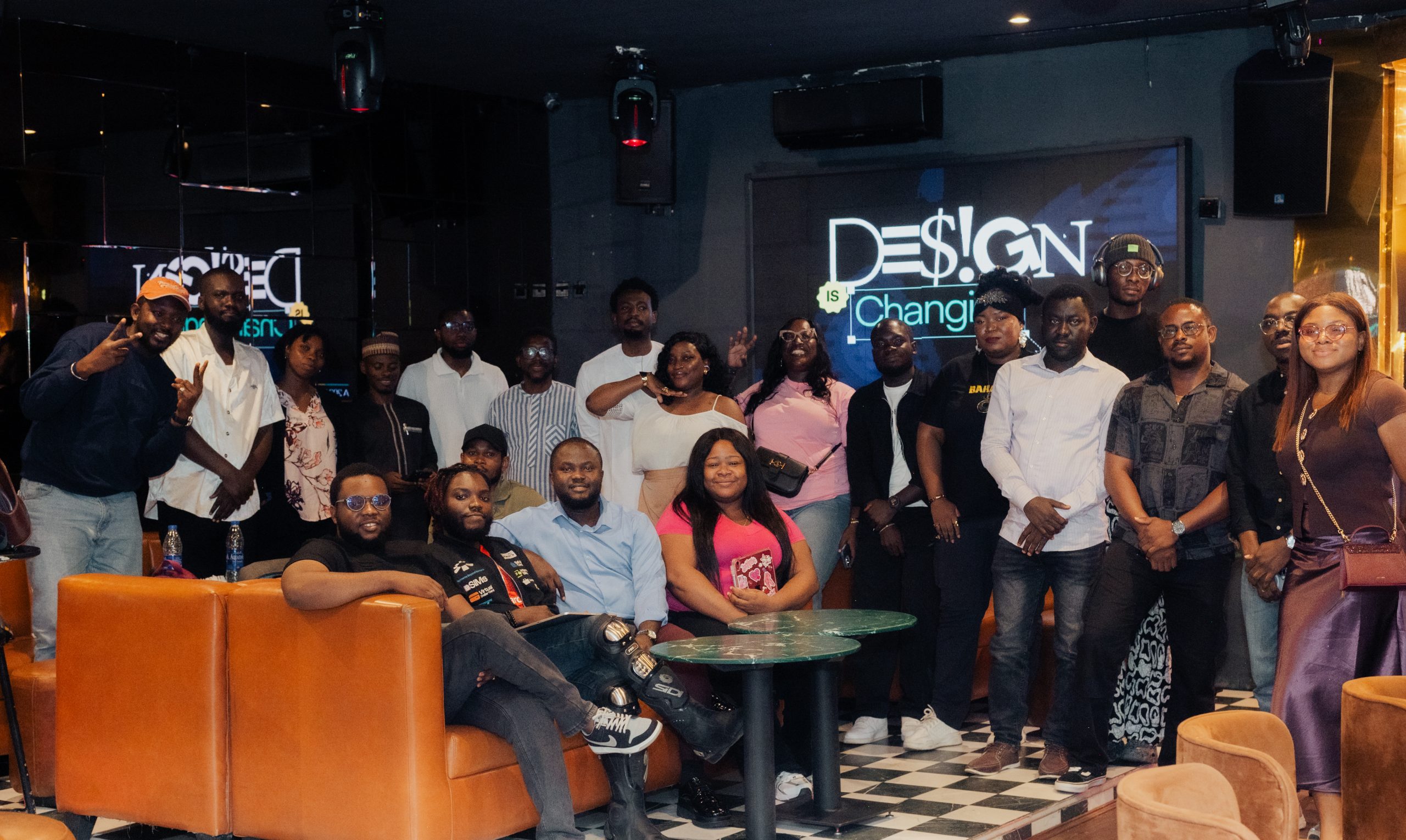
This was where the Design Report was launched.
Now, designers have a very particular energy when they’re first put in a room together with people they don’t know yet. There is a baseline level of confidence, because designers are people who have spent years developing strong opinions about things, and have learned to defend those opinions fiercely. But there is simultaneously a kind of measured reserve, because they’ve also been taught not to give too much away too early.
The first twenty minutes of the mixer felt exactly like this: our guests only showing the most polite version of themselves, with professional handshakes and “yes, glad to be here”s.
And then the food and drinks arrived.
While we’re not saying our creamy pasta and jollof rice were the turning point, we’re also not denying it. Because for most people, great food (and we know it was great because almost everybody left with takeouts — Creamy Pasta Supremacy!) is the perfect excuse to loosen up.
Designers came as honoured guests, and we know they left feeling very celebrated. And super stuffed. (Yay for food.)
Our Perfectly-Perfect 3 Million Naira Challenge
We did not just hand out a report at our design mixer and call it a day. (We told you—we like to do things differently, even when there’s no prototype to copy.)
Tucked into the report is a stat that stuck with us: 72% of users associate pixel-perfect design with low-effort, automated content, while the imperfect, human-handed kind earns 1.5x more interaction.
So right after we launched the report, we also launched the Perfectly Imperfect Challenge: an open call to every Nigerian-based designer to interpret organic imperfection however they saw fit. There was no brief telling them what “imperfect” should look like aside from the Design Report as a guide.
There was total creative freedom to run with it.
The Challenge ran for about two weeks, and by the time submissions closed, picking winners was genuinely difficult with the great entries that came in.
Eventually, we did. ₦3,000,000 was on the table: a first-place winner, a second-place winner, and two third-place winners, taking home ₦1,000,000, ₦1,000,000, and ₦500,000 each, respectively.
We hosted a live Twitter Space with hundreds of designers and design enthusiasts joining in real time, and that’s where we announced our winners.
If the report was us talking about the industry, the Challenge was us putting our money where our mouth is. (Quite literally.)
What the Numbers Say, Three Weeks In
Our 2026 Design Report has been public for about three weeks now.
In that time, it has reached well over 5,000 people across the ecosystem, which, for a design trends report published by a fintech company, tells us we’re not the only ones curious about the future of design. And that we’ve done a great job.
We want to be careful not to make this section feel like a victory lap (even though we love to brag!), because the number is genuinely not the point; it’s just evidence that the point landed. The point is that we asked a question that people in the design ecosystem were also wondering about, we did the work to answer it properly, and the answer resonated.
Five thousand people and counting is not just a download stat for us. We’re pretty siked about it.
We will always have a thing for genius designs and the specific satisfaction that comes from making something that makes people stop and look twice. But more than anything, this year reminded us that creative work is at its most meaningful when it serves something larger than the people who made it.
Our design report is now out, but this conversation has only just started.
And while we still don’t get paid a dollar every time someone reminds us that we’ve hacked this design thing, next time it happens, we can do more than offer a polite appreciation.
We can say, “thank you—and we’ve done something about it too.”